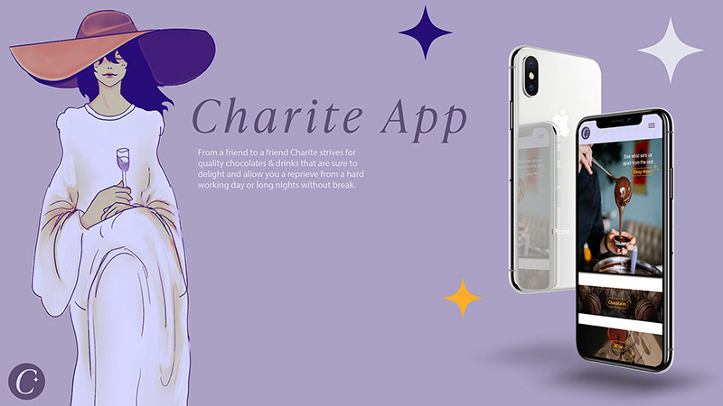
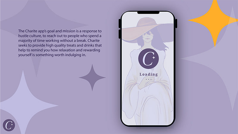
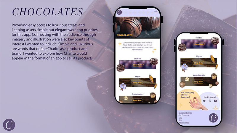
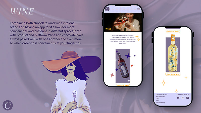
Problem
Client desired a mobile app design that showcases their wine and chocolate that complements their soft‑luxury aesthetic while remaining approachable. Information within the app should be easy to navigate & engaging. The overall experience should present the products so enticingly that you'll want to eat them through the screen.
Solution
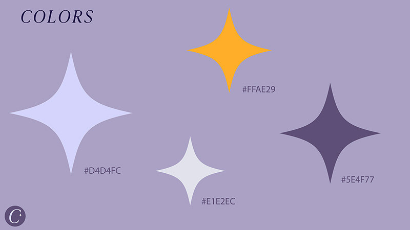
Utilizing brand colors & product imagery, the app design focuses on softer, almost cozy aesthetics to help customers feel at ease while still remaining luxurious.
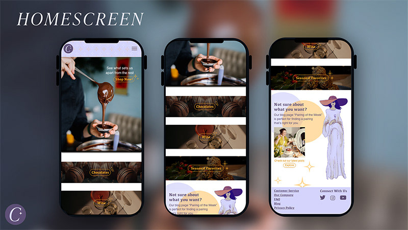
By prioritizing easy access to products on the home screen, customers can immediately view their options and make their decision faster. Those with busy schedules and limited time will be able to purchase their treats efficiently.
The app also features a blog section on the home screen that links to the brand’s full blog, which offers pairing recommendations. This helps first‑time customers and busy users quickly identify the most popular pairings and make confident decisions.

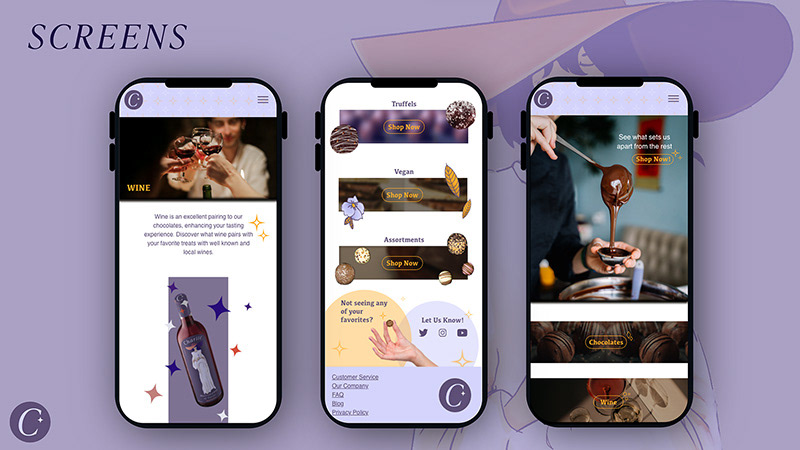
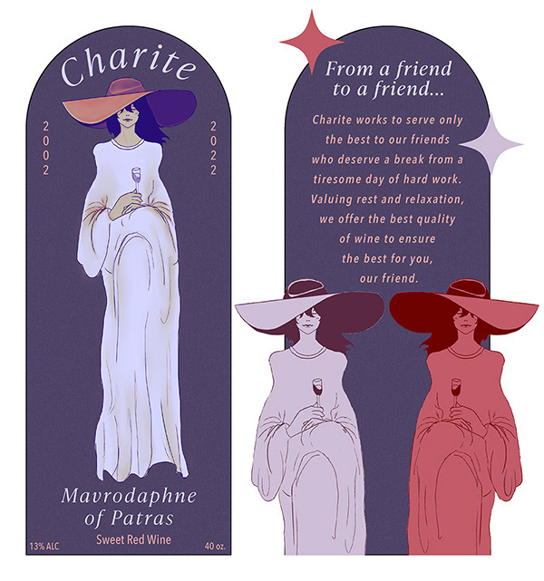
The Sweet Red wine label has a darker more mellow appearance to stay easy on the eyes when working late into the night.