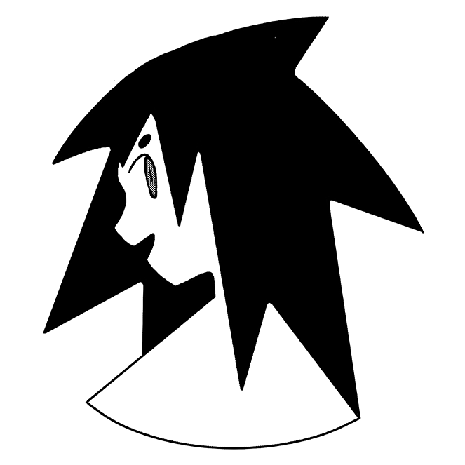
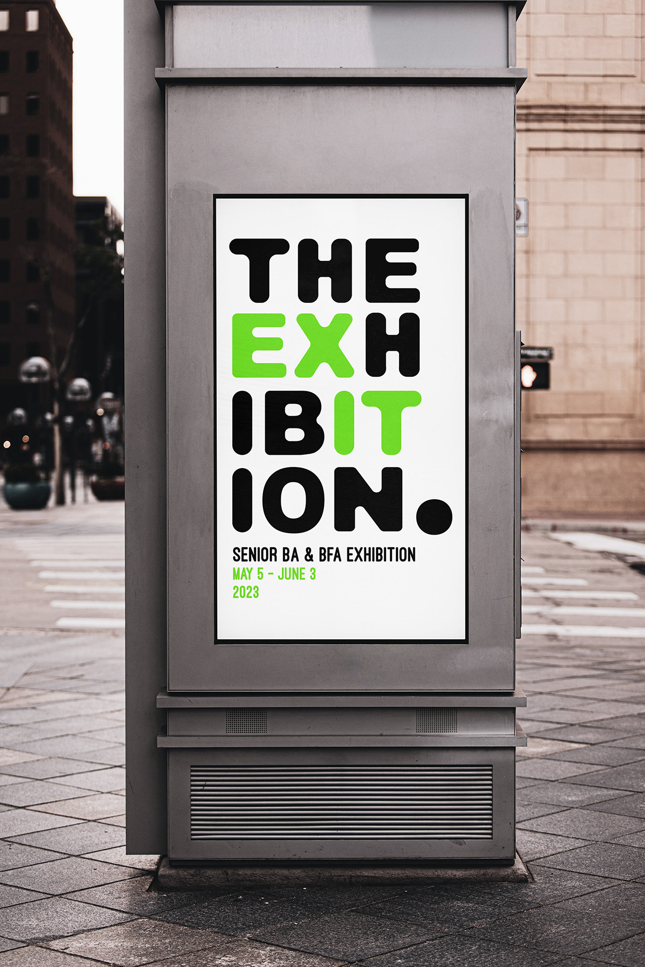
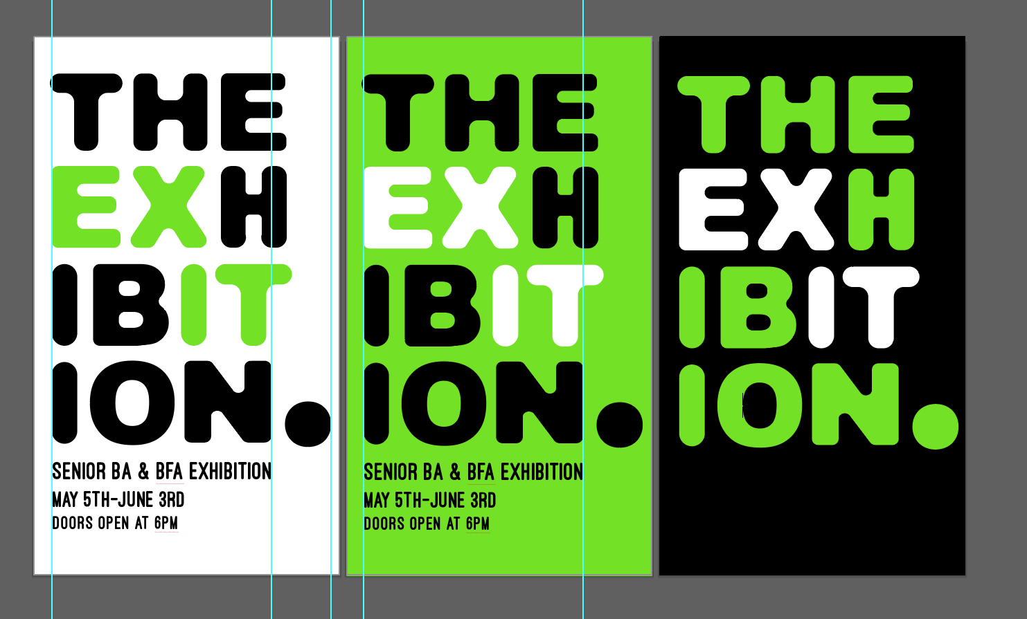
This visual was my initial design for our exhibition logo, which explores the thought of what it means to exit from an important stage of life into the next. Many names for our exhibition were presented, and when it came down to "The Exhibition" I found the words inside the most interesting & expanded on it.
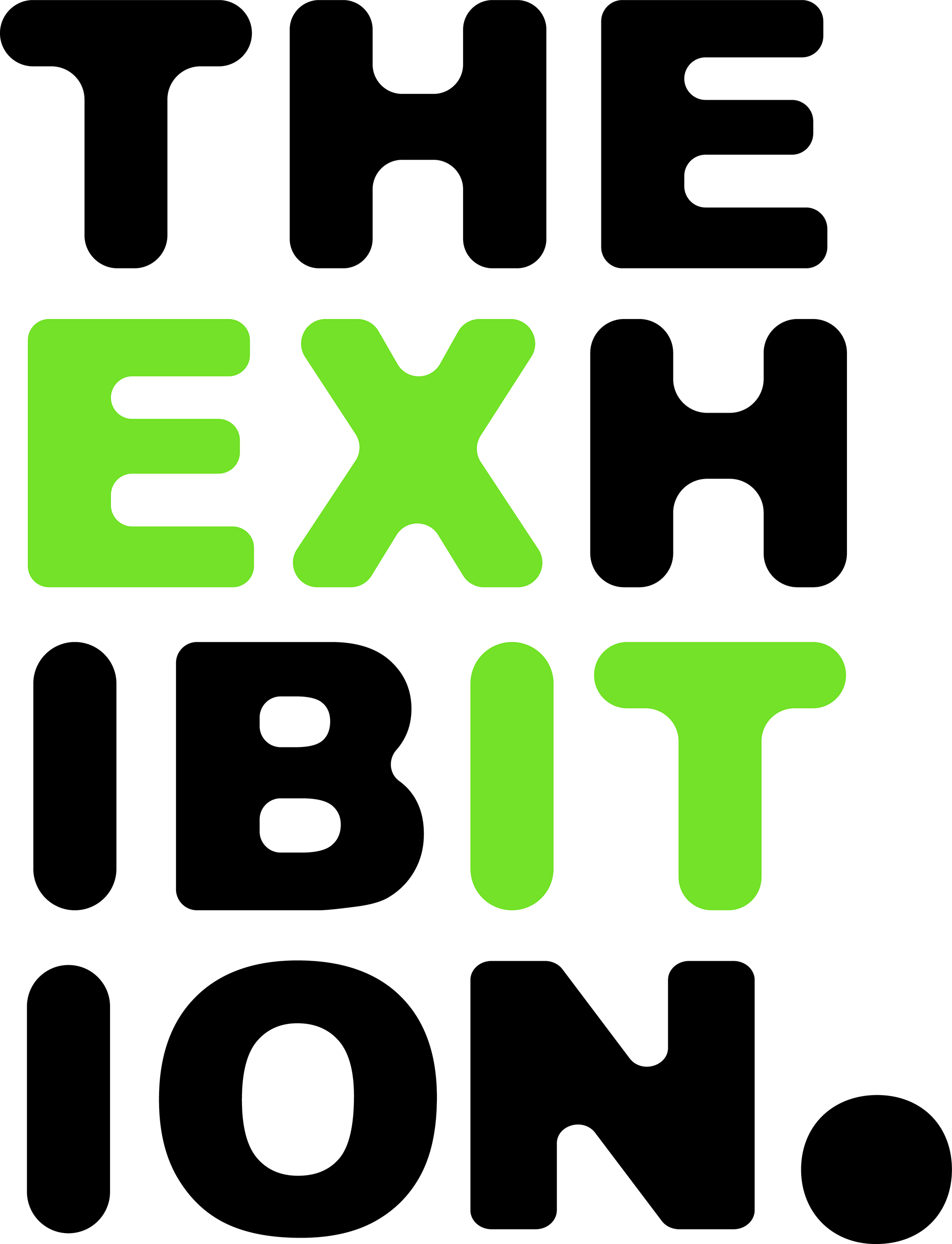
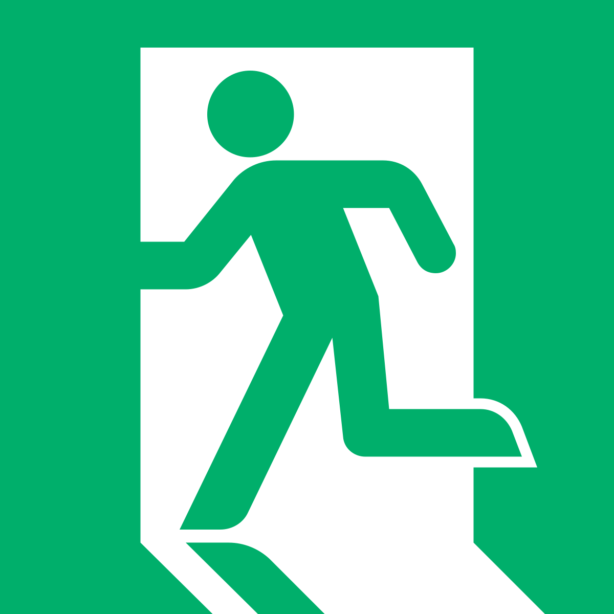
The color scheme & name was inspired by the act of "exiting" and the well known sign that helps people identify an exit. As senior art majors wrapped up their four years into one last show, there were many goodbyes and exits being made. This proposed visual identity was all about seniors making their way out into new adventures & closing the chapter on their academic journey.
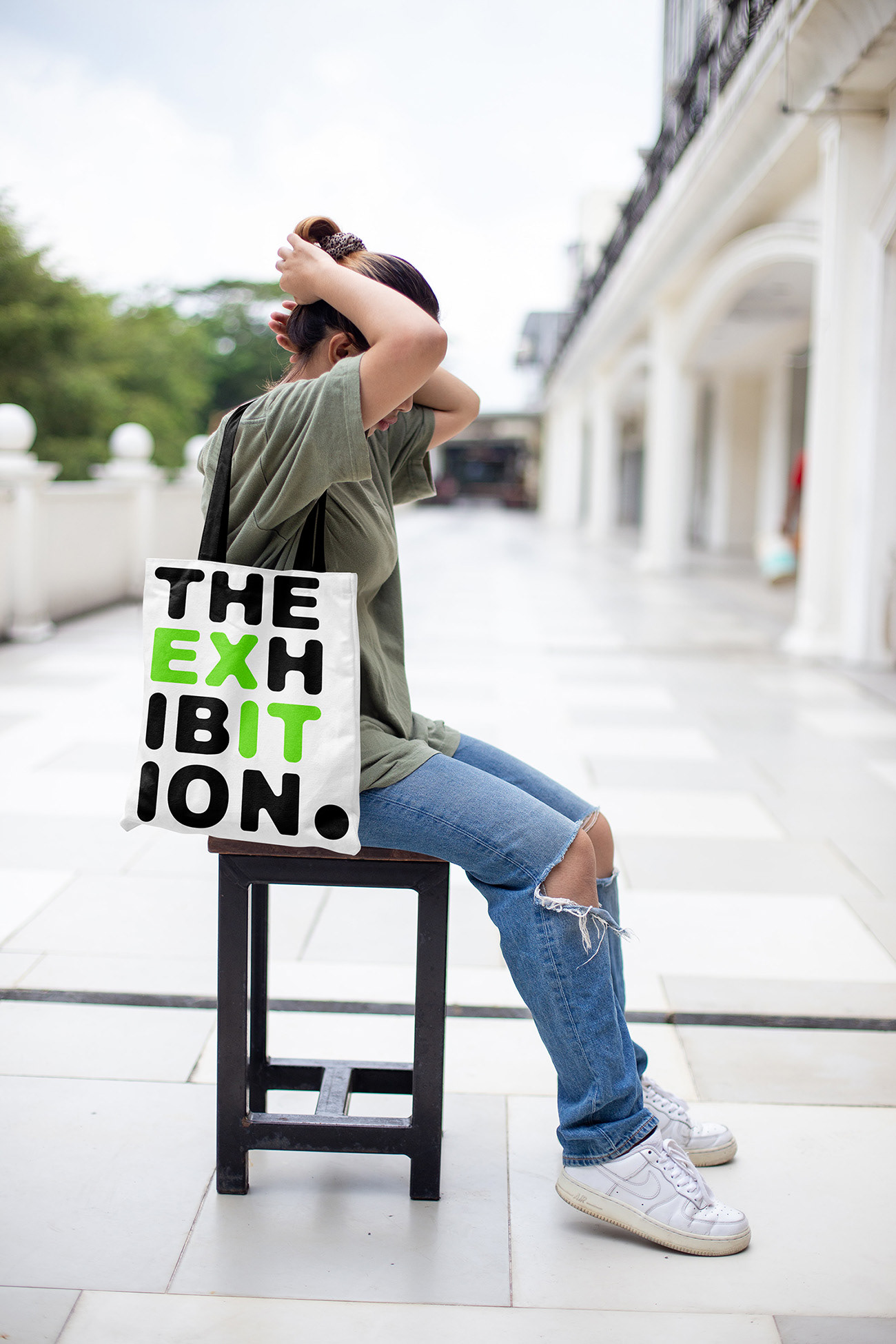
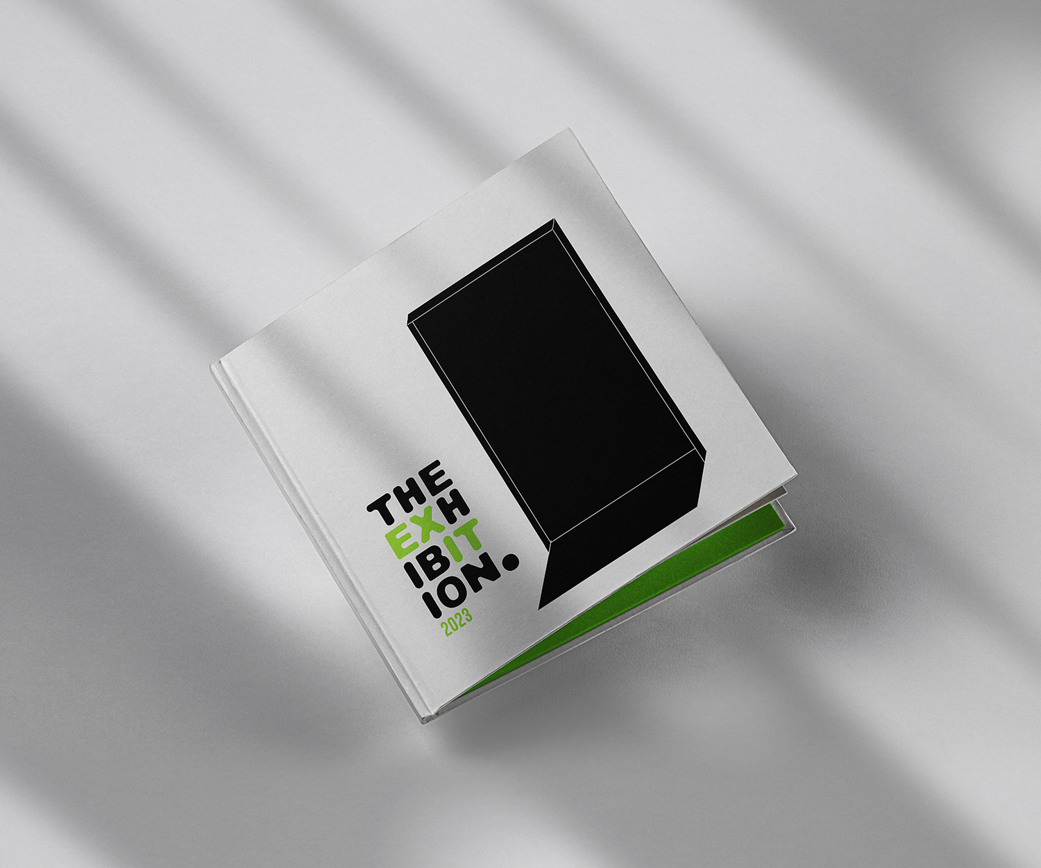
The design team valued the idea of visitors to the exhibition and seniors being able to take away something from this impactful event. I designed this tote bag of the exhibition logotype & a book that holds every seniors exhibition piece, so that the memories and works apart of "The Exit" can be remembered and appreciated.